
Anyhoo....I've been thoroughly enjoying an Online Card Class featuring Tim Holtz. It's been an AMAZING class, and I've learned so many foundational aspects of stamping (differences in inks and how they react with each other and other "liquids", differences in types of paper used for stamping and how they affect the image, differences in embossing powders...and the list goes on and on!!!)
Today's lesson, Tim taught about the effects of acrylic paints and crackle paints. These "projects" I'm posting here are some items I made incorporating the techniques learned today. I've chosen to make these into Christmas ornaments to share with my nieces and nephews this year. Yes, they are very non-traditional, but I kind of think they're fun. And I love the uniqueness of them.

Here's some close-ups of the individual butterflies:


These butterflies use the same die, only I used the butterfly "outline" as well as the "solid" butterfly. (See the explanation "How I did it" and my supply list!)

And, here's the close-ups of these butterflies:


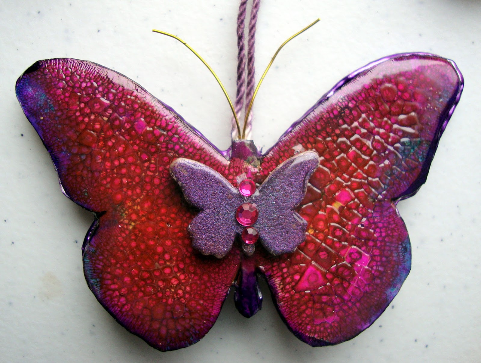
All the butterfly shapes were die cut with the Sizzix Butterfly die. My orginal die cuts were made out of regular medium-weight chipboard. I then decided to cut some of the "solid" butterfly shapes out of white adhesive-backed chipboard. I was concerned about the colors of the ink being more muted on the regular chipboard.
For the bodies of the butterflies, I adhered the white chipboard die cuts to the regular chipboard die cuts. I then covered them with a fairly heavy layer of Distress Crackle Paint (Rock Candy). Once the paint was dry, I covered the die with various colors of Distress Inks. (I stamped the Distress Ink pads on my craft paper, spritzed with water, and painted on my butterfly.) I LOVE that crackled effect!)
The center butterfly on the first 4 butterflies was cut out of regular chipboard with the same die. I sponged the small butterfly with Versamark ink, then brushed a heavy layer of Perfect Pearls powder over it. Then, I covered it with Glossy Accents to give the shiny effect. Finally, I embellished the body with gems and added wire for the antennaes.
The "outlines" of the butterflies were also cut out of regular chipboard with the same die. I sponged the die cuts with Versamark, then heat embossed with embossing powder. I adhered the outlines to the solid body of the first 2 butterflies with dimensional dots for the extra dimension. The outline of the 3rd butterfly was adhered to the body with Glossy Accents.
The bodies of the last 3 butterflies are accented with Stickles.
The strings for the ornaments were made using regular string and swiping them with a coordinating color of Distress Ink.
And....here's the supplies:


