Well, the Summer Card Camp 2011 has come to a close. What a wonderful opportunity it has been to learn new techniques, glean advice and suggestions from the "experts", and to be challenged with color combinations I may have never thought of on my own. This card was made using the color scheme for Week 4 of the Camp as shown below:
For the background behind the flower, I tried Jennifer McGuire's "finger-inking" technique. First I stamped the background with Hero Arts Envelope Pattern stamps with Versamark ink, then heat embossed it with white embossing powder. Then I applied the finger-inking technique using Distress Inks. The flower was stamped with a Brilliance "Peacock" (3-tone) ink pad. I cut the flower out, then applied it to a sky blue card stock and cut again leaving a border of blue. The flower was then applied to the background using foam adhesive dots to give it a dimensional look.
Again, the Card Camp was a BLAST, and I can't wait for the next one. Hopefully, next time I won't go on vacation right in the middle of it. Had a GREAT time in Canada though!!
Sunday, July 24, 2011
Wednesday, July 6, 2011
ROAD TRIP!!!
This is my last post for a while......my last card for the Summer Card Camp for a while..... :( However, I'm soooooo EXCITED because I'm going to hit the road for Canada to visit my daughter and son-in-law. YAY!!!!!! If you happen to be reading this post, say a prayer for me for safe travel!! Blessings to all!
Heartfelt Wishes
Here's another card for the Summer Card Camp based on Week 2's color combo. I love these colors and have had a lot of fun working with them. Once again, the stamps are all colored in with Distress Inks misted with water to create "watercolors". I love the affect they give and the way they blend together so nicely. I added some Distress Stickles to the butterfly to give it a bit of a sparkle.
Monday, July 4, 2011
One more card with the summer colors for the Summer Card Camp. I'm very pleased with the way this one turned out. I stamped the image (one big Magenta stamp), then heat-embossed with white embossing powder. Once again, I "watercolor painted" with Distress Inks. I thought about putting a sentiment on it, but I was afraid it might take away from the look.
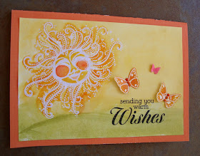
For this card, I decided to use a technique taught by Shari Carrol called "Watercolor with Distress Inks". The technique is simple, just stamp the distress ink directly onto a clear acrylic block, spritz with water, and paint. I like the watercolor affect and I LOVE the fact that you can use Distress Inks to achieve it. Distress Inks have got to be the most versatile ink pad ever made!!! |
This picture was taken at an angle in order to see the shiny, pearly affect of Perfect Pearls mixed with water and sprayed onto the stamped image. I LOVE this effect!! |
These cards were made for the Summer Card Camp using the new color combo for the week as shown below:
Sunday, July 3, 2011
Window Card
This was my third attempt at a "window" card. First two were not too cool!! I found that getting the sentiment stamp on the acetate was more challenging than I thought! I kept smearing the ink. This one stamped without smudging, but I had to cheat a little bit and fill in some of the black on the sentiment with a felt pen. Anyway, I'm pleased with it overall. I'll keep practicing, because, as they say (whoever 'they' are) Practice makes Perfect! BTW, I must give credit to Jennifer McGuire for her inspiration. She does some amazing work, so be sure and check out her web site!
Saturday, July 2, 2011
OCC Card #3
This card was also made for the Online Card Class, only I used a different color combo. I'm always challenged with making masculine cards. I actually copied the card idea from an example made by the very talented Kristina Werner I love the color combination. |